❝the cold winds are rising❞
|
Silhouette Trading Cards
Posted Saturday, December 17, 2011 // 10:21 a.m.
 I idea behind these pieces was that common-curtesy was declining in our society, and that it was essentially going 'extinct'. I took common words and phrases that are considered polite and then changed them so I had them in the form of animal shapes. By doing this, it would be much easier to show 'extinct' because then I could incorporate weapons used to kill the animals (which would also have the double meaning of 'killing' the politeness). To accomplish the finished work, I had to screen-print the words then with a red marker, color in the weapons. Screen-printing the words were a lot harder than I thought it would be because first I had to cut out the shape on contact paper which was very tricky because I had a lot of curves and wanted to keep them instead of sharp edges. Something else that was also tricky was how all the letters had to connect a certain way or else you would end up with missing letters and random spaces. When it came time to actually screen-print, I believe that to be the hardest part. There were numerous things that could go wrong like clogging or printing over the contact paper and having a big smudge on your finished product. All that happened to me, but I got passed it and learned a lot of different techniques that helped me get better finish products One thing that I really like about my finished product is how the words came out. Because of the difficulties of the contact paper I had to change a few angles and sizes. I was worried that it might come out the opposite of how I thought it would but luckily it didn't. Something though that I didn't like and would change was the red marker that I used to color in the weapons. It didn't really come out the way I wanted it too so to me, the pieces doesn't look as unified as it could be. Other than that I really liked how my final piece turned out and I was happy to be able to experiment a bit with screen-printing which was something that I eagerly wanted to try out. -Sai Labels: work [art] Oversimplification
Posted Wednesday, October 5, 2011 // 10:04 a.m.
Self portraits are always a good way to express yourself to the world with having to say anything. Some people chose to make a portrait that is blatantly obvious and some chose to go the abstract route to really make the viewer think. For this art assignment, I chose to go the abstract route and really make my viewers think.The requirements for this assignment were to have contrasting sides of your personality and make a self portrait that shows these sides but also shows them in unity. What inspired me to go the abstract route and make something out of character was my research on suprematism for a different project. From the time I saw it I was intrigued and blown away by the wonderful simplicity to it, so I decided to incorporate some of that style into my self portrait. 
At first when you look at my self portrait, you just see some shapes. I had to do some research on what shapes mean and also the colors I used. Let me start of by saying that the black cross in the middle symbolizes transition, unity, hope which ties in to both sides of this piece. And the large circle that seems to be the holder of everything represents wholeness, perfection, cycles, and life. Now, if you look at the right side, you'll see two upside down triangles. These shapes when up right, represent stability. When they are turned upside down though, they then represent instability, which symbolizes my childhood. It was very crazy and confusing. More so than other children's. As well inverted triangles also mean femininity and that suits me because I'm a girl. Now on to the colors of the triangles. One is yellow and one is a brilliant/bright red. The color yellow is associated with joy, happiness, freshness, and energy. It can often be used to issue warnings and is a lighthearted color. The light red similarly represents joy, passion, danger, and love which is more suited towards my more adventurous childhood. I chose this colors because I believe that it really represents my childhood, full of joy and innocence but a little dangerous.
As you can tell, this self portrait may look simple and almost meaningless but it represents such a diverse and big part of me. I am very happy of how it turned out and how it can trick a viewer into thinking of it as just a couple of shapes. -Sai Labels: work [art] Heather Horton - Portraits
Posted Sunday, September 18, 2011 // 3:39 p.m.
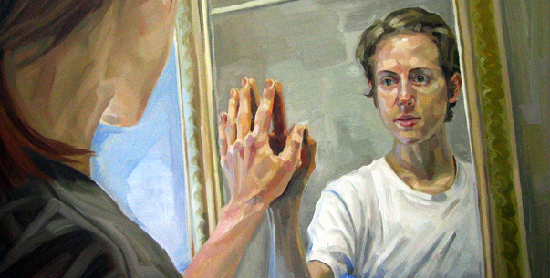 Heather Horton is a Canadian artist born in Burlington. She recently (2002) completed the illustration program she was taking at Sheridan College and now has her art exhibited in group, solo, and juried shows. Horton was also chosen to join the Society of Canadian Artists and the Ontario Society of Artists. Heather Horton is represented by the Abbozzo Gallery, Loch Gallery and the Kurbatoff Art Gallery. She also has her works in private collections around the world including in Canada, Germany, Great Britain, and the United States. I would classify Horton's style as realistic but not completely. She has a unique technique that makes use of the realistic and adds on a sort of stylized broken colour. I find this is pleasant to look at and it really makes it a signature for her. Horton is known for her large collection of portraits and the one I really like is called "Self Portrait (Bedhead)'.  What I really like about this portrait is not only the simplicity but also the thoughtful look on her face. It makes me want to know what is going on or maybe what happened or what she is thinking about. Most portraits I've come across is someone in a pose and I don't really want to know anything more. I may admire the beauty or colour or even technique but I rarely stop and think of what was happening beyond the portrait. Horton states that "there is a prevailing sense of isolation and alienation in my paintings. I want the viewer to wonder what is beyond the borders of the canvas."(1) and that is exactly how I felt while looking at her portraits. Practically every one makes you wonder a bit and that is the thing I find most interesting about her paintings. It is not just a portrait but a story that you can play out with your imagination.
If you want to check out more portraits and paintings by Heather Horton, visit her website here or her blog, Heather Horton Artwork.
-Sai » (1): source quote » also, please note that I could not find the specifics on the first painting posted. Labels: work [art] hello, hello, hello
Posted // 12:19 p.m.
Hello again everyone! I'm back and I'm starting anew. I also wanted to try something different so you might be seeing a lot of random posts about things that I find fascinating and things that inspire me. This year is all about organization and meeting deadlines, so to celebrate this new change I decided a new layout was in order and I also 'revert to draft'-ed my old posts. It's like a blank canvas right now and I'm loving it!Labels: personal |
 refresh
follow
profile
refresh
follow
profile
I'm a CyberARTS student »CyberARTS @ LCI affiliates
CyberARTS •
Payal •
Kevan •
Narali •
Elijah •
Blaire •
Jaylen •
Mike •
Haley •
Sara •
Stephen •
Jennifer
archive
September 2011 •
October 2011
November 2011 •
December 2011
|